

This report will provide a comprehensive assessment of Bitcoin, based on both statistical and technical analysis.

Bitcoin on-chain metrics
We will take into consideration the data and evaluate the cryptocurrency to reach our conclusion. YouTube blogger Genesis has compiled a comprehensive set of on-chain metrics and technical analysis that will be used in conjunction.
 First part of bitcoin’s on-chain metrics
 Supply:
2️⃣0️⃣ Supply Delta
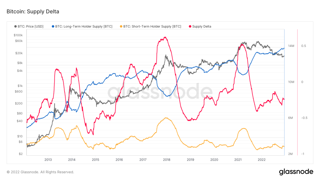
(Image credit: Glassnode)
- (a) Blue—Long-Term Holder Supply (the supply that is held by long-term holders);
- b) Yellow—Short-Term Holder Supply (number of coins held by short-term holders);
- c) Red—Supply Delta.
Bitcoin Trading
2️⃣1️⃣ Percent Supply LTH-STH
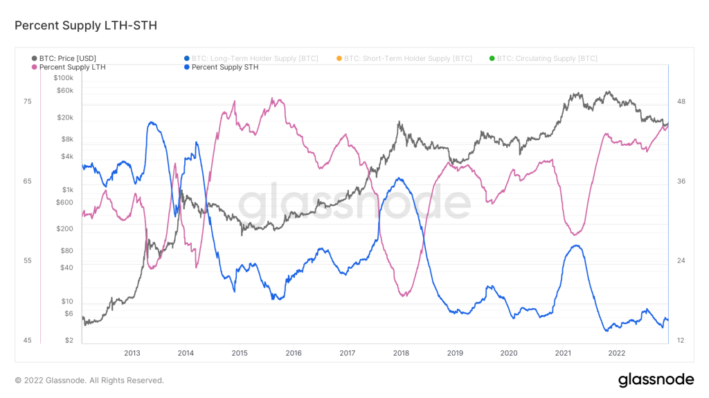
(Image credit: Glassnode)
Hardware Wallet
(Image credit: logll.com)
[azonpress_tables id=”2″]
2️⃣2️⃣ Percent Supply in Profit
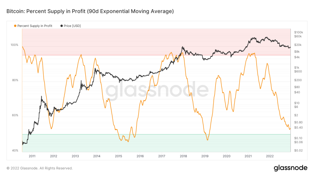
(Image credit: Glassnode)
Percent Supply in Profit: A percentage of supply which is in profit is known as the percentage supply in profit. This metric reveals the amount of total supply (total circulating supply) that is in profit.
A percentage of Supply in Profit is calculated by dividing Supply in Profit by Total Supply and multiplying it by 100%.
Metric inputs:
- Supply in Profit (supply that is in profit);
- Supply in Loss (supply that is at a loss);
In the current situation, we have the following:
Metric reading, using 90d EMA, is 53%. Above the 50% mark, there is the key support block. A range between 50% and 45% is more valid empirically. In this range of temperatures, the bottom of cycles was formed according to history. I believe that since the index is equal to 53% now, there will still be the potential for the index to fall by 4-6% before it reaches the mark of 49-47%, which I believe will be a noticeable turning point since the decrease will be stopped.
In the direction of the purchaser, 7/10. How to Trade Bitcoin with ByBit MT4

(Image credit: logll.com)
2️⃣3️⃣ Max Pain: Supply Underwater
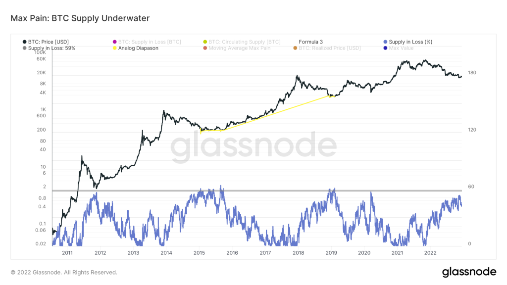
(Image credit: Glassnode)

2️⃣4️⃣ Liquid and Illiquid Supply
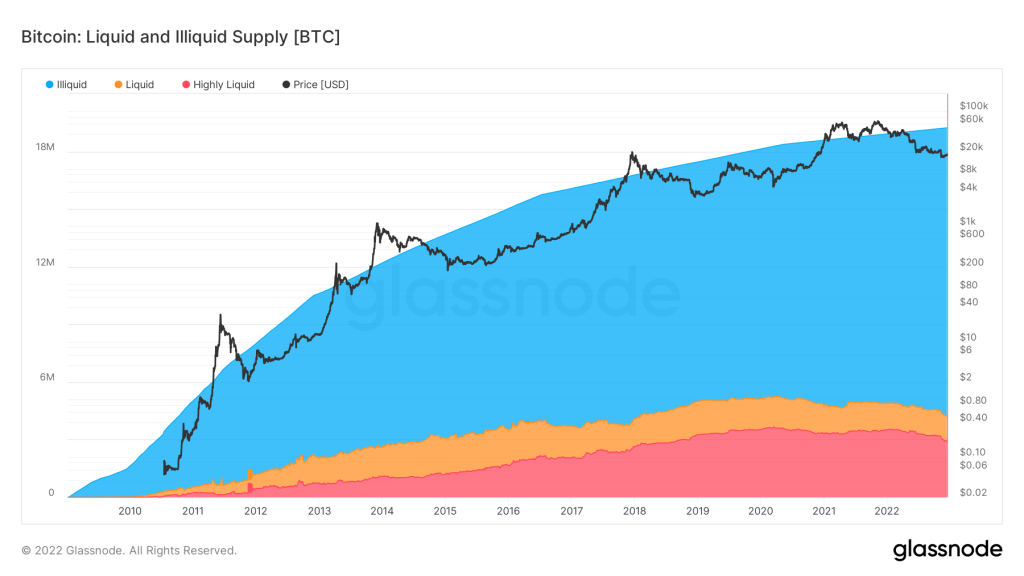
(Image credit: Glassnode)
- Illiquid
- liquid
- highly liquid
2️⃣5️⃣ Liveliness
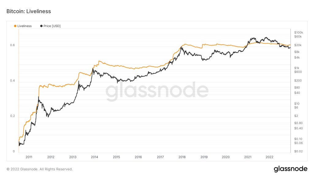
(Image credit: Glassnode)
Liveliness: BTC activity is defined as the ratio of the sum of currency days destroyed to the sum of all currency days ever created. The author of the indicator is Tamas Blummers. This allows us to understand investor behavior. It rises as long-time holders liquidate their positions and falls as coins are accumulated and held.
In theory, if all coins are moved in a block, the Live Ratio can instantly reach “1”. It can also be “0” if there are no transactions on the blockchain other than the issue. Therefore, a value between 0 and 1 can be considered a measure of “liveliness”.
Current situation:
Currently, the average value of this indicator is 0.61. The indicator shows higher values in a bull market than now. The relatively low market value at this stage is the result of the reluctance of long-term holders to liquidate their positions, which confirms their interest in accumulating positions and learning the available supply.
According to this indicator: 7/10 for buyers.
Stablecoin:
2️⃣6️⃣ SSR
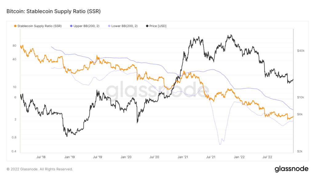
(Image credit: Glassnode)
SSR: The Stablecoin Supply Ratio metric measures the degree of purchasing power of a stablecoin and assesses the possibility of changes in Bitcoin’s price.
Stablecoin Supply Ratio — is calculated by dividing the total market cap of BTC by the total market cap of all stablecoins in circulation (known and monitored).
(SSR = BTCmcap / Stablecoin mcap)
Metric input:
– Bitcoin market cap;
– Stablecoin market cap (USDT, TUSD, USDC, USDP, GUSD, DAI, SAI and BUSD);
Current situation:
The main conclusion that can be drawn from the SSR indicator data is that the purchasing power of stablecoins is currently quite high. This is evidenced by such a low value of the index.
The score for this metric is: 7/10 for the buyer.
2️⃣7️⃣ SSR Oscillator
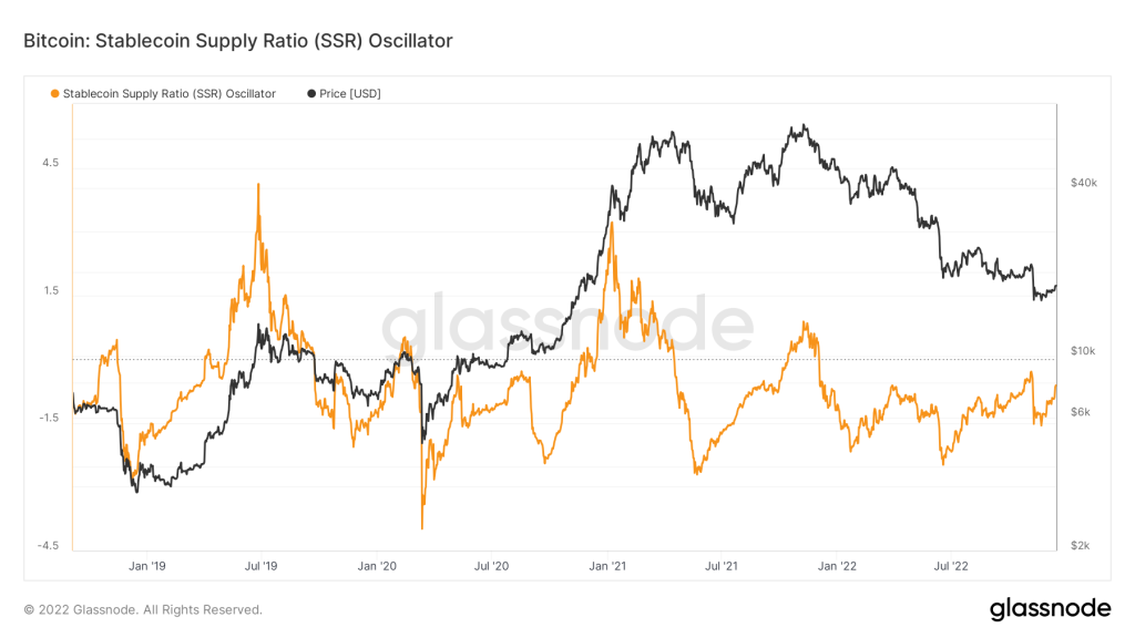
(Image credit: Glassnode)
SSR Oscillator: Stablecoin Supply Ratio (SSR) Oscillator – Determines how the 200d SMA SSR moves within the Bollinger Bands. This indicator was first proposed by Willy Wu.
— a low value of the indicator, when it is equal to -2 and lower, means that the fiat currency has a strong purchasing power;
Using this metric, we can see very clearly the buying power of stackcoin and can use this data to estimate the potential for bitcoin price fluctuations.
Current situation:
The SSR Oscillator is still quite low, indicating that the fiat currency (stablecoin) has strong buying power. The current average of the index = -0.6, which undoubtedly indicates the long-term growth potential of Bitcoin. Statistically, a value this low indicates that Bitcoin is accumulating globally.
The score for this metric is: 8/10 for the buyer.
Lifespan:
2️⃣8️⃣ Supply-Adjusted CDD
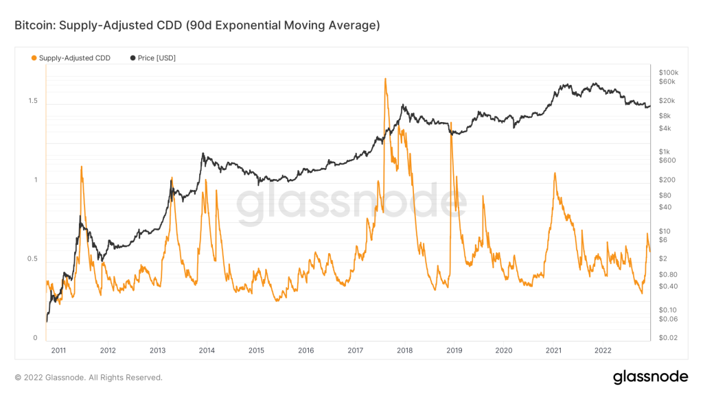
(Image credit: Glassnode)
Supply Adjusted CDD: The metric is designed to show the movement of old coins that have been in cold storage for a long period of time. Strong spikes in the metric signal that many coin days are being destroyed, which in turn indicates that in the Bitcoin network, coins that were bought many years ago have stirred up, and most likely just to be sold.
A feature of the modified version of the Supply-Adjusted CDD is that it considers the effect of time on the Coin Day’s Destroyed metric.
Calculation formula: Coin Days = Number of Coins * Number of Days Coins Destroyed.
Current Situation: Throughout the bear market, the Supply-Adjusted CDD was on a downward trend, indicating the unwillingness of the big players to sell their old coins. Even before the price dropped from $21,300 to $15,863, the indicator had already reached a low of 0.31, which coincided with the behavior of the metric in past cycles. Thereafter, according to history, there is a final impulse on the bear market, and parallel to this decrease there is an impulse growth on the metric, indicating the selling of coins with large amount of coin days to a certain part of long-term holders (as we know the LTH group is also divided into subgroups, like those who have 1k, 2k and even those who have more than 10k BTC in their management). Many factors are influencing it: both miners and some long-term holders are selling their old coins, everyone is human, and everyone is affected by emotions in one way or another. Currently, the index has already realized part of growth at metric, but I think that not all growth has been passed, there is still reserve.
Assessment by this metric: 8/10 towards the buyer.
2️⃣9️⃣ Binary CDD
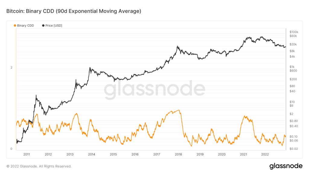
(Image credit: Glassnode)
Binary CDD — is an indicator of how many days have been destroyed by coins in binary mode. The goal is to see if the number of Coin Days Destroyed during the period of interest was more or less than the long-term average. It is possible for the Binary CDD to be either “1” or “0”, depending on whether today’s coin days are above or below the average.
— A supply-adjusted CDD is greater than the long-term average when the indicator = 1;
— A supply-adjusted CDD of less than the long-term average is construed as a value of indicator = 0.
With this chart, we remove daily noise by using the EMA to select a quarterly period.
Situation as it stands:
In bear markets and accumulation phases, the index tends to move sideways, indicating a prevalence of young coins. Hodlers don’t sell their old coins at current prices because they have no incentive to spend them.
This metric is estimated to be 9/10 in the buyer’s favor.
3️⃣0️⃣ Entity-Adjusted ASOL
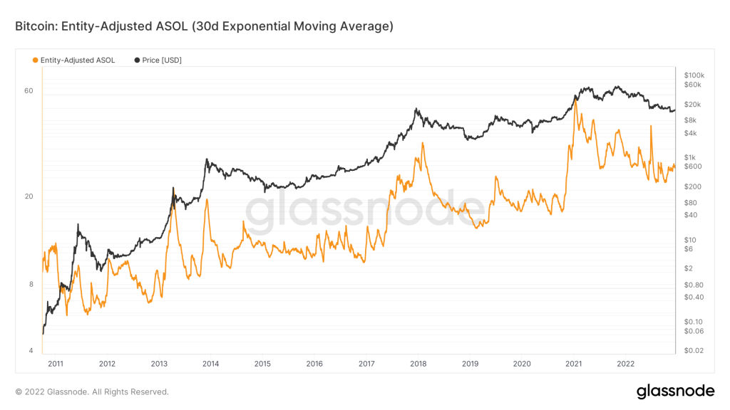
(Image credit: Glassnode)
Entity Adjusted ASOL: Average Lifetime of Spent Production is a measure of the true age of all these UTXOs ie. for transactions made on a certain date.
This indicator is a modification of the original ASOL indicator. Its main advantage is that it ignores internal transfers in the short term, i.e. transactions that take place at addresses of the same organization (for example, “exchange”).
— High values usually indicate an increased share of network traffic related to the use of old coins, which is usually associated with long-term holders who benefit from high volatility in the market.
— A low value usually indicates that the daily flow consists mainly of new coins in use, which are usually associated with traders and short-term holders.
Current situation:
Using a clearer, noise-free graph, it is clear that the index has a fairly low value, which clearly shows that the cost is mainly new coins moving from one short-term holder to another, in other words, older coins are not entering the market and returning to circulation. The spread of daily traffic in the market is a characteristic criterion of the accumulation phase at the end of a bear market. I believe that this indicator will remain at such a low value for a long time. After all, big gains in bull markets only happen when owners liquidate old tokens.
The expected value of this indicator is: 9/10 for the buyer.
3️⃣1️⃣ Entity-Adjusted MSOL
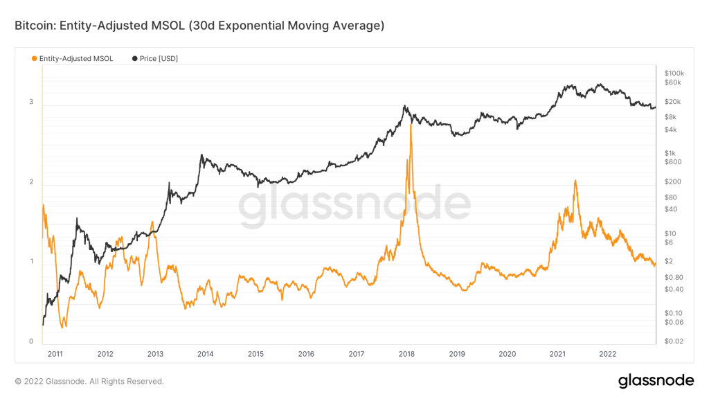
(Image credit: Glassnode)
Entity-Adjusted MSOL — Average Spent Release Duration (MSOL) is a metric that tracks the average age or supply (daily flow) of a coin. This indicator shows which token influx is currently dominant: old or new tokens. The unit-adjusted MSOL, like its predecessor, lacks the impact of insider transactions.
— A high value indicates that the market is dominated by old coins;
— Low values indicate the dominance of new coins.
Current situation:
Right now, we can see that the index has declined in the entire bear market. This indicates a gradual decline in market dominance of older coins. Now when you see such a low unit adjusted MSOL it is safe to say that the market is dominated by daily flows ie. most of these are newly used tokens, which are usually associated with traders and short-term holders.
Rating for this indicator: 9/10 for buyers.
Miners
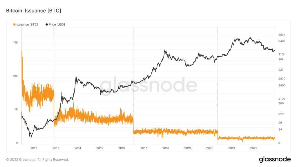
3️⃣2️⃣ Issuance
(Image credit: Glassnode)
3️⃣3️⃣ Hash Ribbon
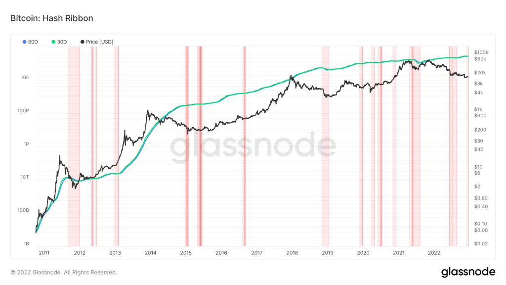
(Image credit: Glassnode)
The Hash Ribbon — is a market indicator that shows when Bitcoin reaches its bottom, when it’s too expensive to mine relative to its cost.
By crossing the 30-day MA over the 60-day MA, the Hash Ribbon indicates that the worst of the miner capitulation is over. Price momentum switching from negative to positive at such moments is a good buying opportunity (transition from dark red to white).
Bull Markets — The hash rate will rise as miners invest in more equipment during bull markets. It increases the 30DMA hashrate faster than the 60DMA.
Bear Markets — There have been instances when miners have been forced to shut down their unprofitable installations during bear markets when their revenues are straining too. When 30D falls below 60D, it can cause miners to capitulate, which will result in a hash tape inversion that can occur.
The current situation:
On November 27, 2022, a light red area has been displayed every day afterward for 60DMA > 30DMA, including today. Miners’ earnings are problematic, some miners are leaving the market, and hash tape inversion occurs, which is characteristic of a bear market late on.
This metric is rated 9/10 by buyers.
3️⃣4️⃣ Difficulty Ribbon
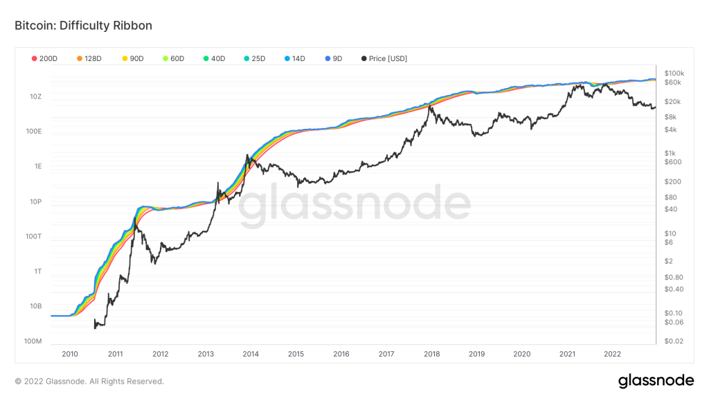
(Image credit: Glassnode)
Using Difficulty Ribbon — as an indicator is an interesting idea that is to use simple moving averages of difficulty (200 days, 128 days, 90 days, 60 days, 40 days, 25 days, 14 days) to create the ribbon that represents bitcoin mining difficulty. It’s historically good to buy tapes when they’re compressed.
This Ribbon is made up of moving averages of mining complexity so that we can easily see how quickly the levels of mining complexity have changed over time.
A visualization of the complexity of the mining network can shed light on how mining affects the price of bitcoin by revealing the impact on that price. It is not uncommon for miners to sell some of their mined coins to pay for production costs as new coins are mined. Prices go down because of this. A weak miner will sell more of his coins to maintain his operations. Eventually, they capitulate, reducing their hashing power and network complexity (tape compression), leaving only the strongest to sell less, which opens the market for bullish price movement.
In the current situation:
As of right now, we are seeing tape compression, which is a positive sign for Bitcoin. Miners who leave the market and capitulate stop selling, thereby stopping the selling pressure, as strong miners can wait out an acute period of a bull market and sell their mined coins when the opportunity arises. The price stabilizes little by little after there has been a large departure of miners from the market, and then goes up. This is the classic accumulation bottom formation.
As a result of this metric, I give an 8/10 to the buyer.
3️⃣5️⃣ Puell Multiple
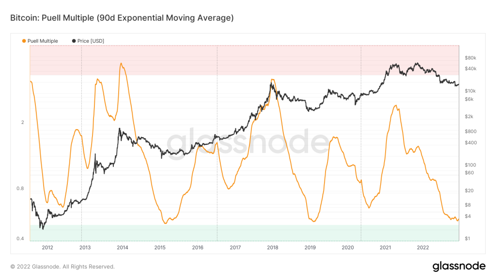
(Image credit: Glassnode)
Puell Multiple — is a series of cyclic oscillators that captures the general behavior of the mining exchange by using a series of cyclic oscillators. This metric is used to calculate the performance of the mining exchange.
It’s calculated by dividing Daily Issuance Value of Bitcoins (in US dollars) by 365, which is the daily moving average.
These are the metrics:
- In USD, daily cumulative income of miners;
- Average income of miners over 365 days;
The low values indicate that daily miners’ incomes are significantly lower than the annual average. This usually indicates that a certain number of miners (weak miners) are prepared to capitulate.
Situation today:
As can be seen from the graph, using the quarterly EMA, the indicator is at extremely low levels. In previous cycles, the market values were similar to those when it was forming its bottom (global accumulation). The indicator appears to have reached its lowest point. As far as I am concerned, it is not very unlikely that there would be a slight decline against the background of some collapse, but in any case Puell Multiple is at its lowest level currently, which is an indication that miners’ incomes are low as compared to their average annual income, and also that weak miners are caging out. Every cycle of the global accumulation stage has shown this behavior.
Based on this metric, we give the buyer a score of 10/10
3️⃣6️⃣ Miner Percent Mined Supply Spent
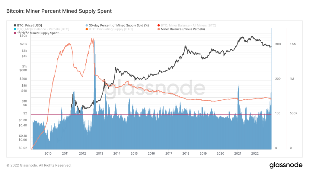
(Image credit: Glassnode)
Miner Percent Mined Supply Spent — is used to evaluate the actions of miners, and is used to estimate how much mined supply is spent by each group during a given period (30, 90, 365 days). To cover production costs, miners must distribute most of the mined coins in some form.
Miners’ balances are compared to the aggregate total issue to estimate the percentage of mined coins spent, based on the n-day change (the period we choose to analyze the graph).
Over 100% means miners are distributing more coins than they mined, depleting reserves.
Here is the current situation:
This figure is above the value of 100%, which indicates that miners are distributing more coins than they have mined. As a result, they sell more than they mine in the last 30 days, so their reserves are depleted. These high values are maintained for approximately 100 days, which confirms the hypothesis that weak miners capitulate.
We estimate this metric as 9/10 for the buyer.
Conclusion
You just finished reading our report’s SECOND PART. A total of 14 new metrics, including HODL, Long-Term Holders, Exchanges, and Addresses, will be included in PART THREE.
We publish our latest Logll Tech News via Telegram and Twitter.
